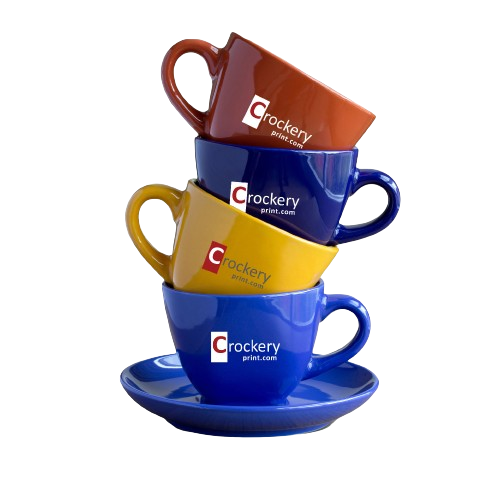
The Impact of Color on Restaurant Crockery plays an important role in the overall branding of a restaurant. Apart from the functionality and durability of crockery, the color and design of crockery also have a significant impact on the dining experience. In this blog post, we will explore the psychology of color in crockery design for restaurants. We will discuss how different colors evoke different emotions and how they can influence customer behavior and perception.
The Science of Color:
Color psychology is the study of how colors affect human behavior and emotions. It is an interdisciplinary field that combines psychology, neuroscience, and design. Different colors have different meanings and evoke different emotions. For example, red is associated with passion, love, and energy, while blue is associated with calmness, trust, and reliability.
The Impact of Color on Restaurant Crockery
The color and design of restaurant crockery can have a significant impact on customer behavior and perception. The choice of color can influence how customers perceive the taste and quality of food. It can also affect how customers feel about the restaurant and their overall dining experience.
Red crockery, for example, can create a sense of urgency and excitement, which can be beneficial in fast-food restaurants. On the other hand, blue crockery can create a calming and relaxing environment, which can be ideal for fine dining restaurants. Green crockery can evoke a sense of health and freshness, which can be suitable for restaurants that serve healthy food.
The Psychology of Different Colors:
In this section, we will discuss the psychology of different colors and how they can be used in crockery design for restaurants.
- Red: Red is a powerful and attention-grabbing color. It is associated with passion, energy, and excitement. Red crockery can create a sense of urgency and can be suitable for fast-food restaurants. However, too much red can also create a sense of danger and aggression, so it should be used in moderation.
- Orange: Orange is a vibrant and playful color. It is associated with warmth, enthusiasm, and creativity. Orange crockery can create a friendly and welcoming environment, which can be beneficial for casual restaurants.
- Yellow: Yellow is a bright and cheerful color. It is associated with happiness, optimism, and energy. Yellow crockery can create a sunny and upbeat atmosphere, which can be suitable for breakfast and brunch restaurants.
- Green: Green is a refreshing and calming color. It is associated with health, nature, and freshness. Green crockery can create a sense of balance and harmony, which can be suitable for restaurants that serve healthy and organic food.
- Blue: Blue is a calming and soothing color. It is associated with trust, reliability, and professionalism. Blue crockery can create a sense of calm and relaxation, which can be ideal for fine dining restaurants.
- Purple: Purple is a luxurious and elegant color. It is associated with creativity, spirituality, and royalty. Purple crockery can create a sense of sophistication and glamour, which can be suitable for upscale restaurants.
- Pink: Pink is a playful and feminine color. It is associated with love, compassion, and sweetness. Pink crockery can create a romantic and whimsical atmosphere, which can be ideal for cafes and dessert shops.
Conclusion: In conclusion, the color and design of restaurant crockery can have a significant impact on customer behavior and perception. Different colors evoke different emotions and can be used to create a particular atmosphere and mood in the restaurant. The psychology of color in crockery design for restaurants is an important consideration for restaurant owners and designers. By understanding the science of color psychology, they can create a memorable and enjoyable dining experience for their customers.

